
The data cover the period up to 1 Jul 2022. The analysis stops there because Greece then moved to weekly, batched reporting, which is not comparable with what came before.
Deaths: confirmed covid deaths as a percentage of each country's population
In the comparison charts the vertical axis shows deaths as a percentage of each country's population and not absolute numbers. Without this, large countries would always look worse than small ones simply because they have more inhabitants.
The two vertical dashed lines mark the start of the 1st wave (March 2020) and of the 2nd (October 2020). There is no official definition of a "wave": neither the WHO nor the ECDC has set dates, so these points are conventional and were chosen to fit the data.
Greece essentially avoided the first wave, and did so more than any other country in the comparison. Up to 30/6/2020 it had 18 deaths and 327 cases per million inhabitants, the fewest of all fifteen countries that appear in these pages (Italy, France, Spain, Portugal, Sweden, the United Kingdom, Belgium, the Netherlands, Ireland, Croatia, Serbia, Bulgaria, Bosnia and Herzegovina, Romania, Albania). For comparison: Belgium 841, the United Kingdom 828, Spain 615, Italy 575, Sweden 528, France 456 deaths per million.
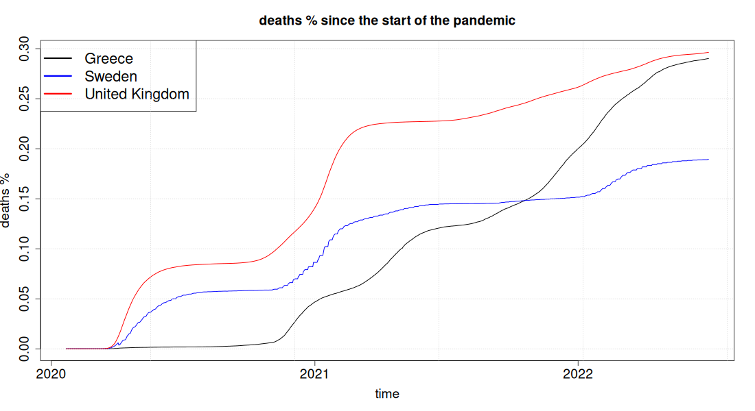
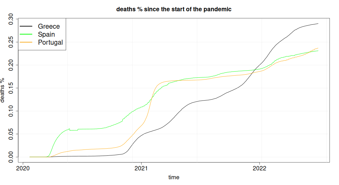
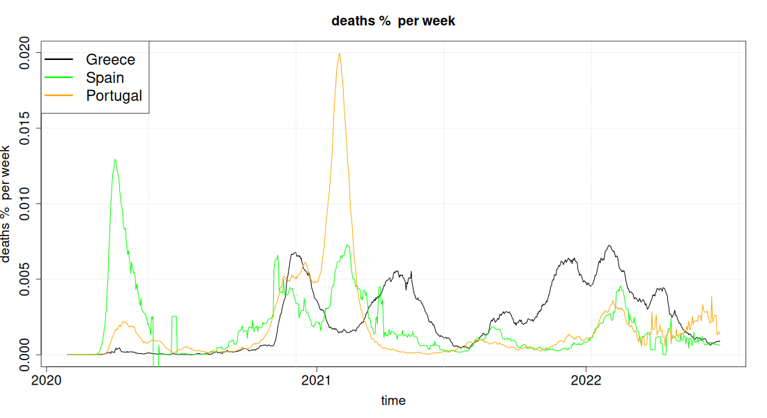
In the cumulative charts this appears as a flat Greek line until the autumn of 2020: almost all Greek deaths occur after the 2nd wave. The country therefore started from an advantageous position and then lost it; that is why the Greek curves later overtake countries that in the first wave had many times more deaths.
The table shows how small the Greek share of deaths was before the 2nd wave. In Greece 98.7% of the period's deaths happened after 1/10/2020; in Sweden, Belgium and Spain the corresponding figure is around 70% (69%, 69%, 70%) and in Italy 79%. The increase column shows the same reversal from another angle: cumulative Greek deaths multiplied by 77 within twenty-one months, while in France, Italy, Belgium, Sweden, Spain and the United Kingdom the increase ranged from 218% to 369%. That number of course starts from an extremely low base; which is why it matters to read it together with the absolute values per million, where Greece again ends up far worse off than countries that started worse.
| Country | Deaths per million at the start of the 2nd wave (1 Oct 2020) | Deaths per million at the end of the period (1 Jul 2022) | Increase (%) in deaths per million at the end versus 1 Oct 2020 | Excess mortality per million (whole period) | Ratio |
|---|---|---|---|---|---|
| Greece | 38 | 2,902 | 7,597% | 3,145 | 1.08 |
| Croatia | 69 | 3,914 | 5,558% | 5,026 | 1.28 |
| Serbia | 86 | 1,846 | 2,050% | 8,119 | 4.40 |
| Bulgaria | 119 | 5,362 | 4,416% | 9,885 | 1.84 |
| Albania | 135 | 1,217 | 802% | 5,688 | 4.68 |
| Portugal | 194 | 2,368 | 1,121% | 2,317 | 0.98 |
| Romania | 253 | 3,417 | 1,252% | 5,844 | 1.71 |
| Bosnia and Herzegovina | 262 | 4,818 | 1,736% | 6,850 | 1.42 |
| Ireland | 366 | 1,519 | 315% | 1,020 | 0.67 |
| Netherlands | 375 | 1,306 | 249% | 1,803 | 1.38 |
| France | 487 | 2,241 | 360% | 1,415 | 0.63 |
| Sweden | 584 | 1,894 | 225% | 1,034 | 0.55 |
| Italy | 594 | 2,786 | 369% | 3,291 | 1.18 |
| Spain | 684 | 2,312 | 238% | 2,310 | 1.00 |
| Belgium | 865 | 2,754 | 218% | 1,918 | 0.70 |
| United Kingdom | 867 | 2,964 | 242% | 2,113 | 0.71 |
Click a column heading to sort the table.
The last two columns are a reliability check. Excess mortality measures how many more people died in total compared with what was expected on the basis of 2015-2019, independently of what each country counts as a COVID death. A ratio greater than 1 means that the total excess mortality of the period is larger than the recorded COVID deaths. That usually points to under-recording or to the wider indirect burden of the pandemic, not necessarily to a difference of definition alone.
Greece has a ratio of 1.08: it under-records slightly, it does not over-record. The large deviations are in the Balkans (Albania 4.7, Serbia 4.4, Bulgaria 1.8), where the official COVID death figures are several times lower than total excess mortality. At that size of deviation under-recording is the likeliest explanation, whereas when the ratio is close to one the difference may well also be due to the indirect effects of the pandemic. In the opposite direction, France 0.63, Sweden 0.55 and Ireland 0.67 attributed to the virus more deaths than their total excess mortality.
Greece, Italy, France
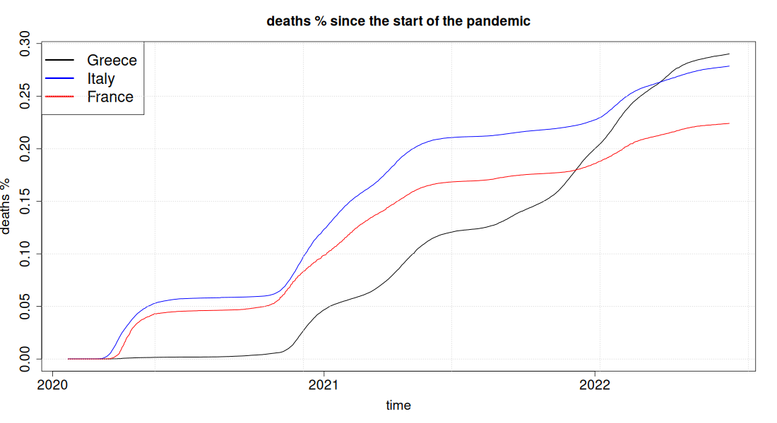
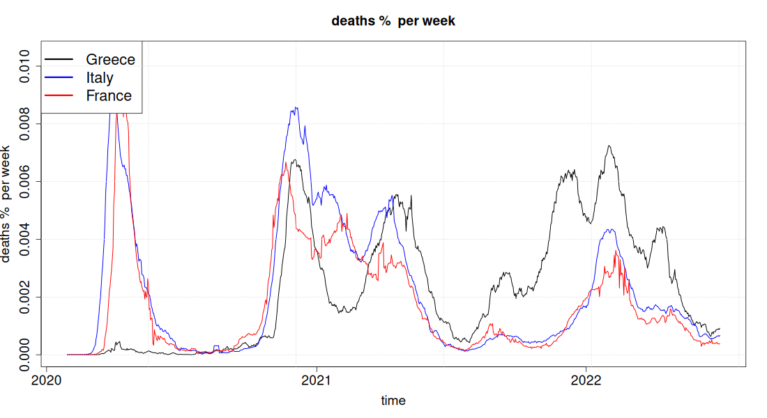
France is the reference country for the whole analysis, because it has almost the same 60+ vaccination coverage as Greece. The cumulative chart shows the reversal the article describes: the Greek line starts lower than any other, at 38 deaths per million at the start of the 2nd wave against 487 for France and 594 for Italy, and ends up higher than both, at 2,902 against 2,241 and 2,786. The weekly chart shows when it happened: the Greek peaks of 2021 and of the 2021-22 winter are higher than the French ones of the same period, while the big French and Italian peaks belong to 2020, when Greece was almost untouched.
Greece, Sweden, United Kingdom (UK)
Greece, Croatia, Serbia
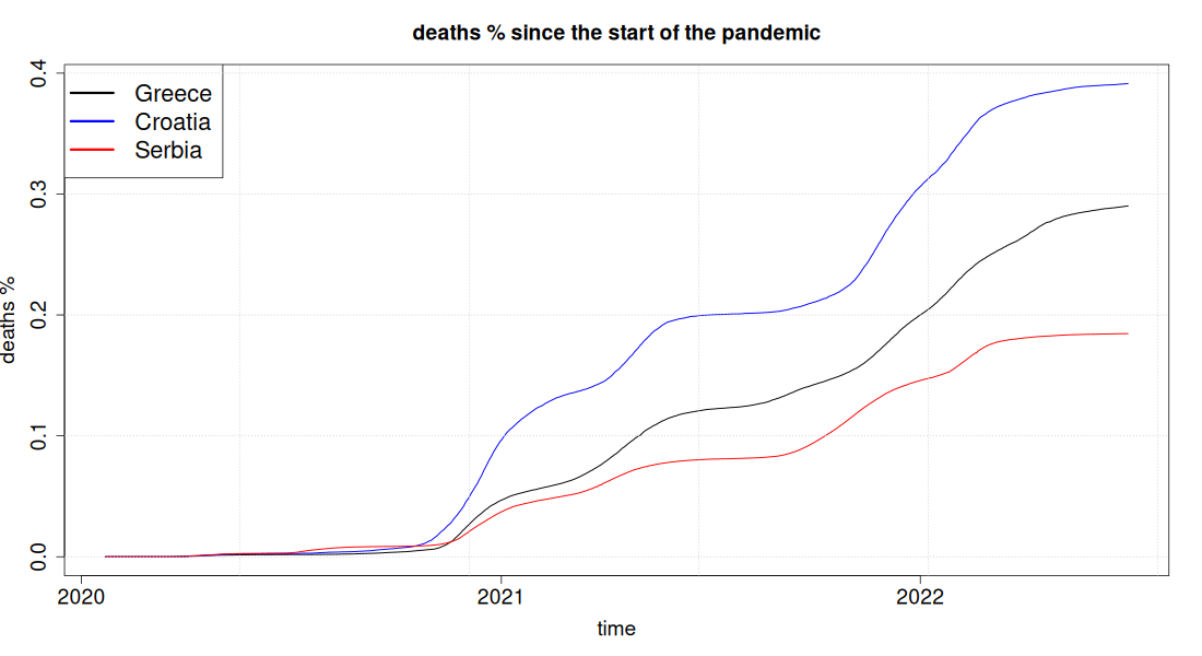
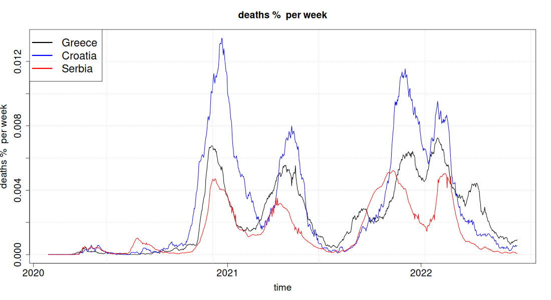
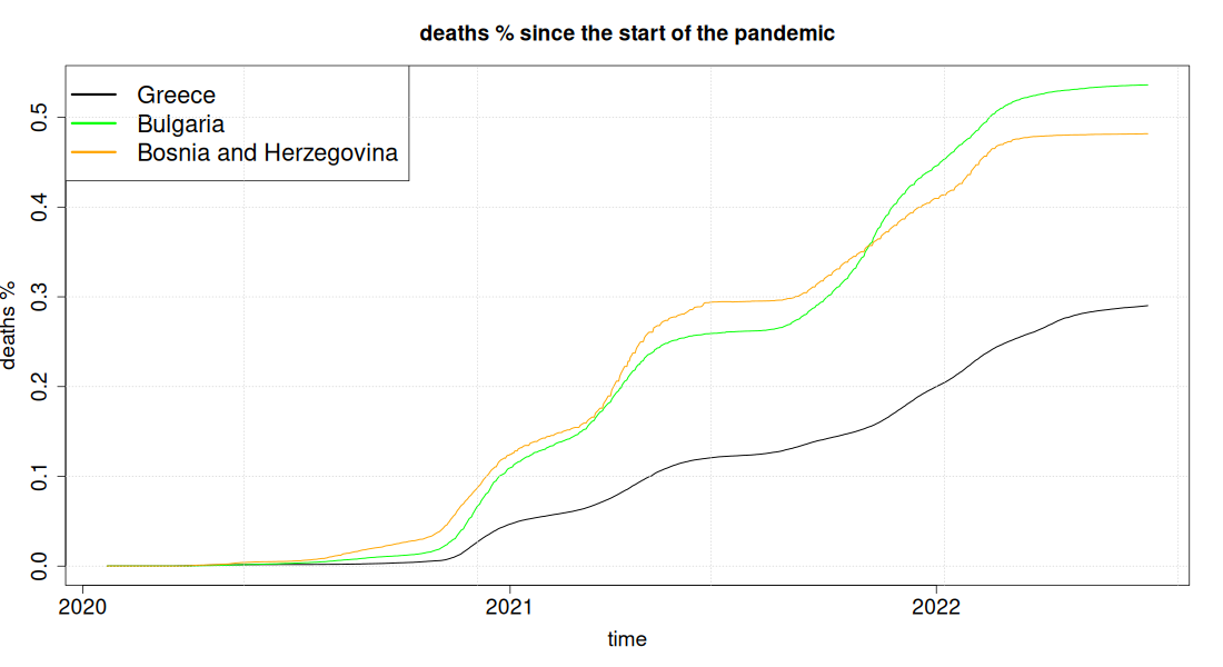
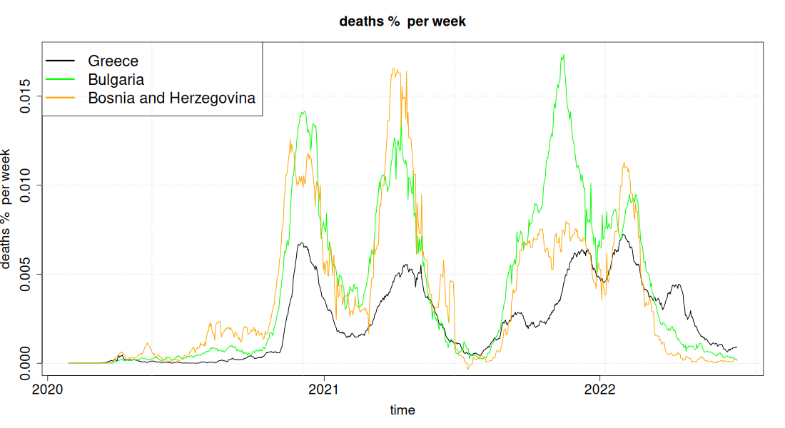
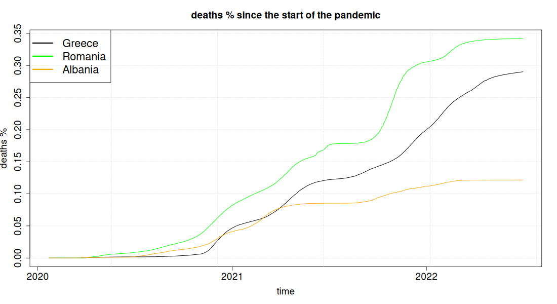
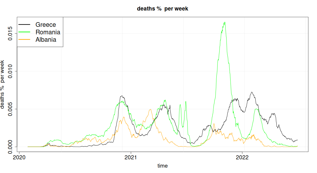
In this section and the two that follow, with the Balkan countries, the curves should not be read the way the previous ones were. They show recorded COVID deaths, and there recording is much weaker: Greece appears above Serbia (2,902 against 1,846 per million) and many times above Albania (1,217), but with excess mortality, which does not depend on what each country declares, the order is reversed: Serbia 8,119, Albania 5,688, Greece 3,145. The ratio of the two quantities is 4.4 for Serbia and 4.7 for Albania, against 1.08 for Greece, meaning their official figures attribute to the virus less than a quarter of the period's total excess mortality.
The comparison with these countries therefore neither supports the article's argument nor refutes it: it simply is not safe with the recorded figures. The countries with comparable recording quality are those with a ratio close to one, such as Croatia (1.28), Bosnia and Herzegovina (1.42) and Romania (1.71), and above all the western European ones in the remaining sections.
Greece, Bulgaria, Bosnia and Herzegovina
Greece, Albania, Romania
Greece, Spain, Portugal
Greece, Netherlands, Ireland
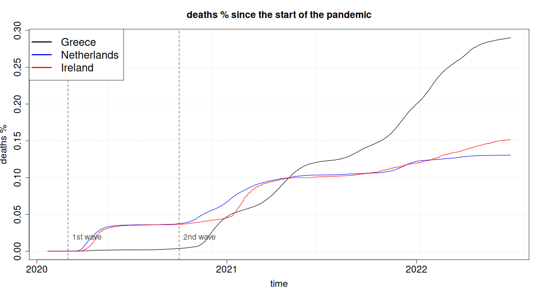
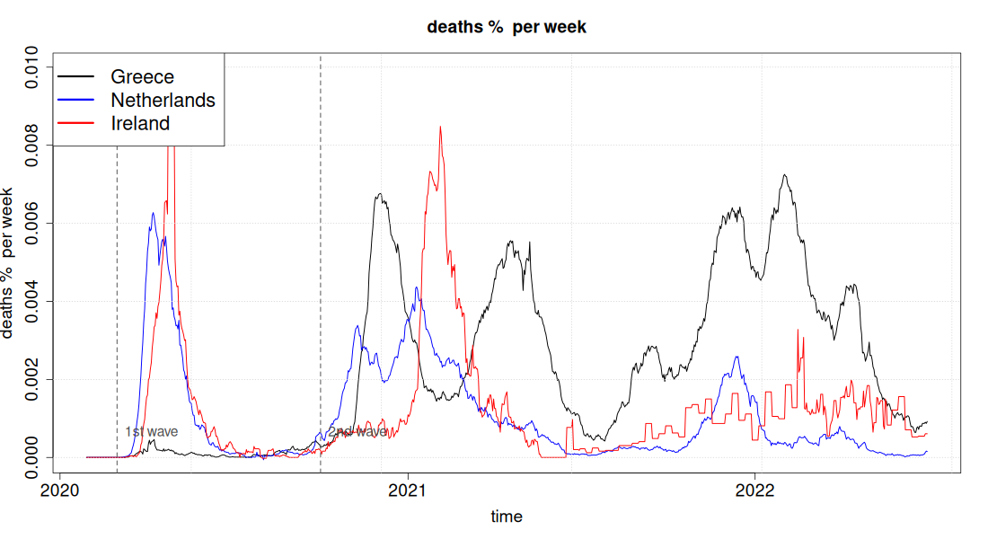
This comparison is the cleanest in the sample, because the three countries meet halfway along the route. At the start of the 2nd wave the Netherlands and Ireland had ten times more deaths than Greece (375 and 366 against 38 per million). In July 2021 the three curves are practically joined: Greece 1,219, the Netherlands 1,036, Ireland 1,013. From that point on, within one year, Greece adds another 1,683 deaths per million, Ireland 506 and the Netherlands 270.
This is not a difference of starting point, nor different luck in the early waves: the three countries begin the last phase from the same place and Greece ends up with two to three times more deaths. The difference that stands out in vaccination coverage is the booster dose among those over 60: the Netherlands 90%, Ireland practically universal, Greece 79%. Excess mortality confirms the ranking independently of definitions: Greece 3,145, the Netherlands 1,803, Ireland 1,020 per million.
Leave a comment
Comments are moderated, and appear with the site's next update.