
The data cover the period up to 1 Jul 2022. The analysis stops there because Greece then moved to weekly, batched reporting, which is not comparable with what came before.
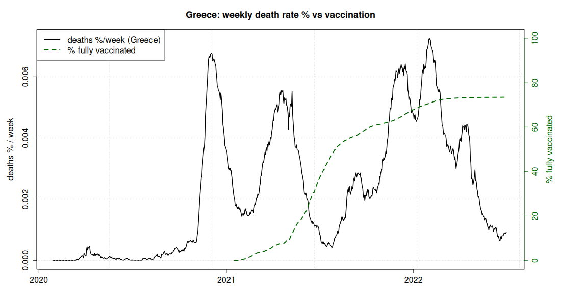
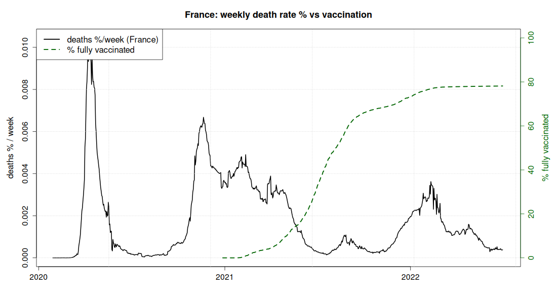
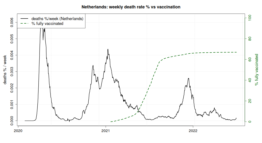
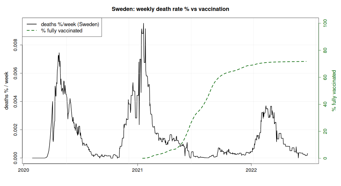
The weekly death rate set against vaccination coverage, for eight countries: Greece, France, the Netherlands, Sweden, Italy, Bulgaria, Romania, Croatia. The reference country is France (the blue line in the 60+ charts), because it has almost the same coverage as Greece and three times fewer deaths. Deaths are expressed as a percentage of the population per week (the "derivative" of cumulative deaths), so that it is clear when they occurred and not only how many.
In the comparison charts the vertical axis shows the deaths of the week as a percentage of each country's population and not absolute numbers. Without this, large countries would always look worse than small ones simply because they have more inhabitants.
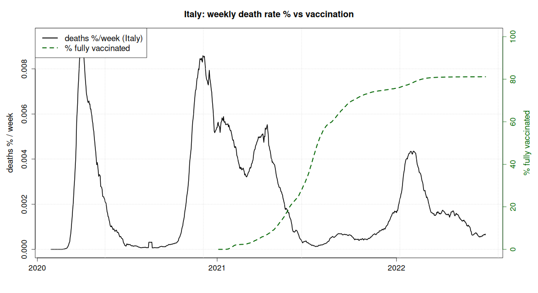
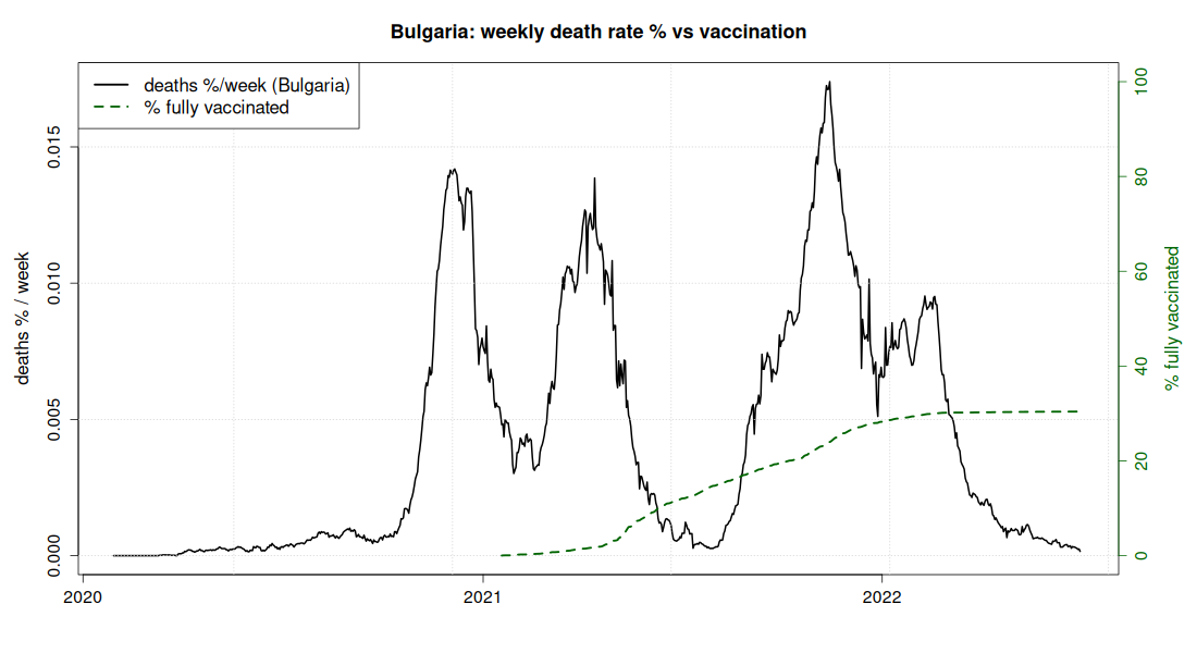
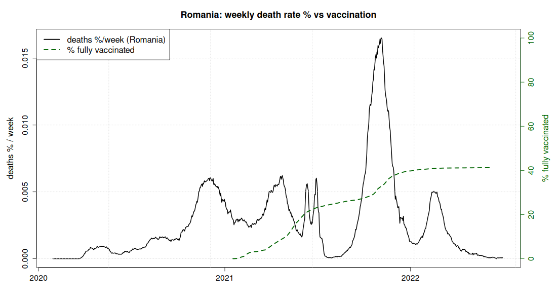
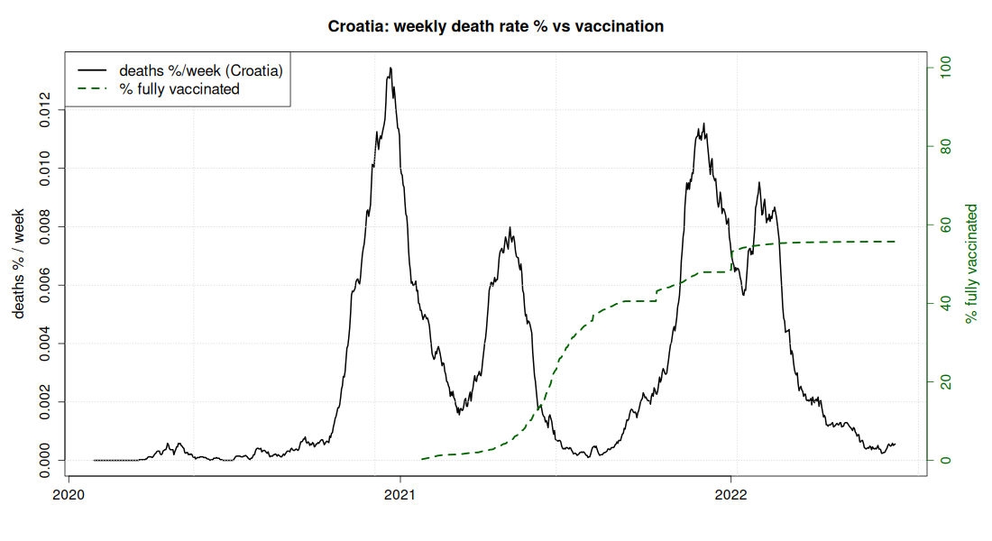
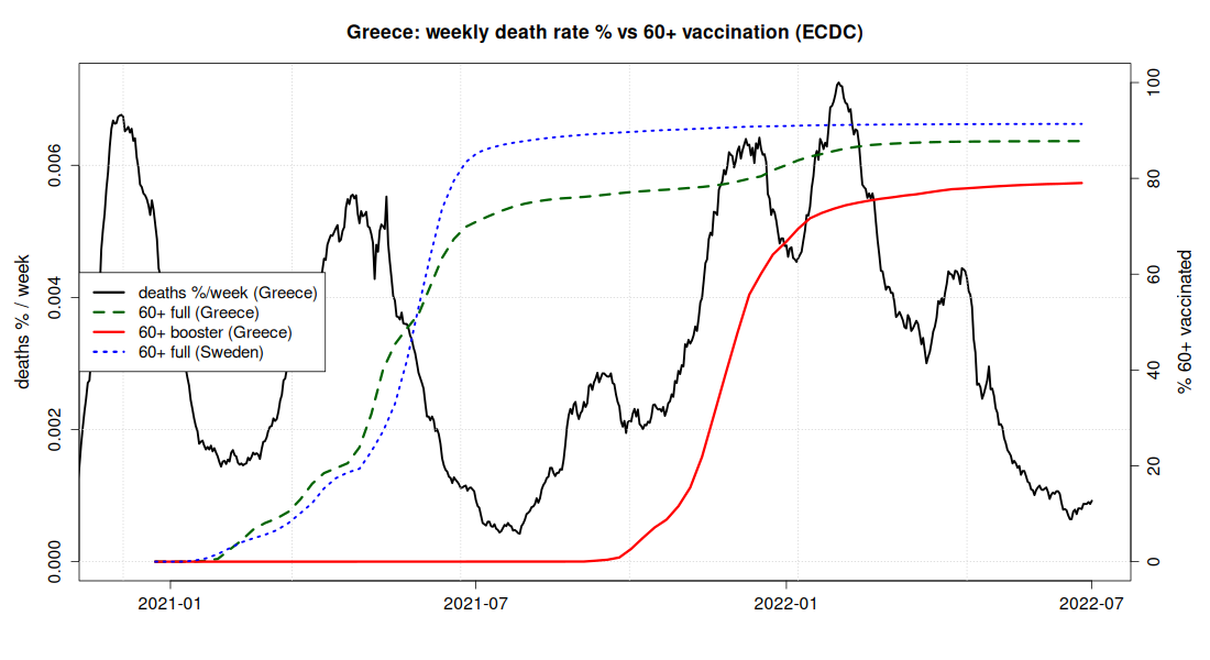
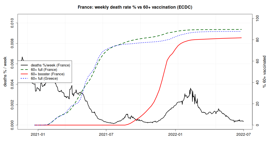
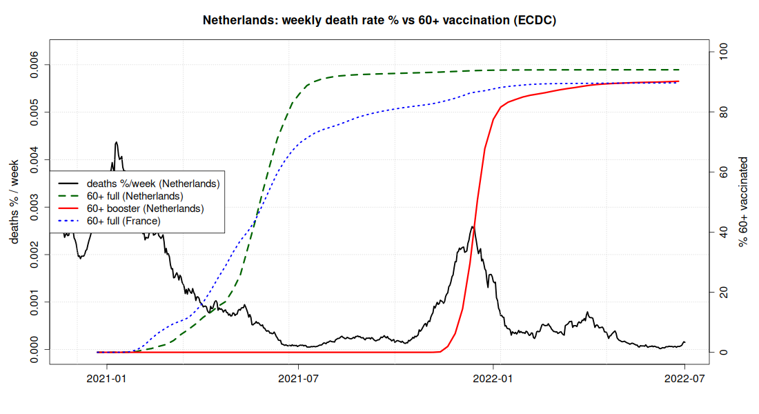
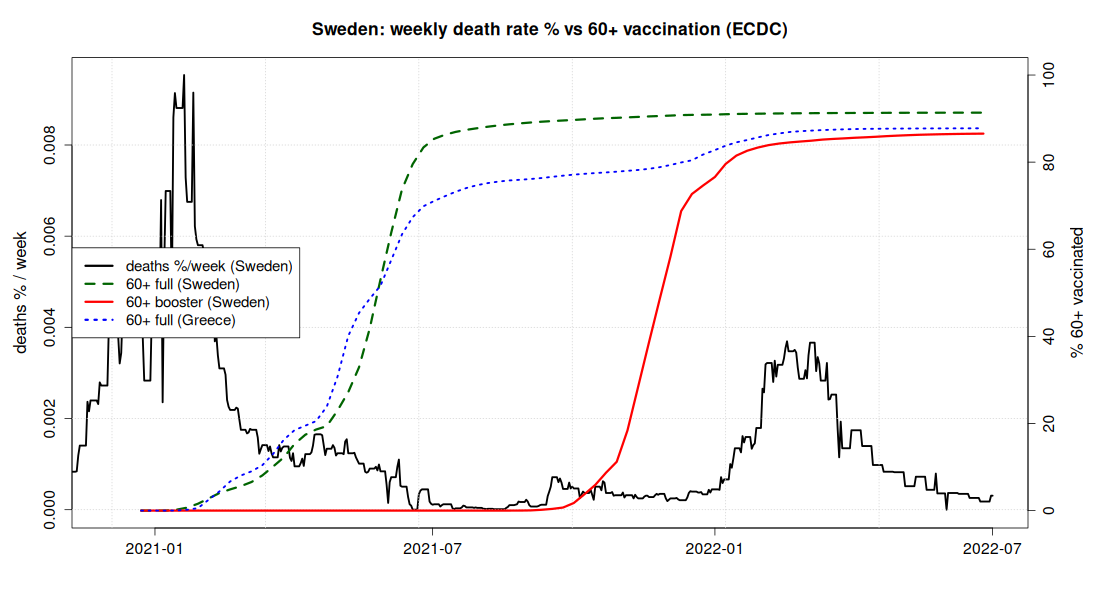
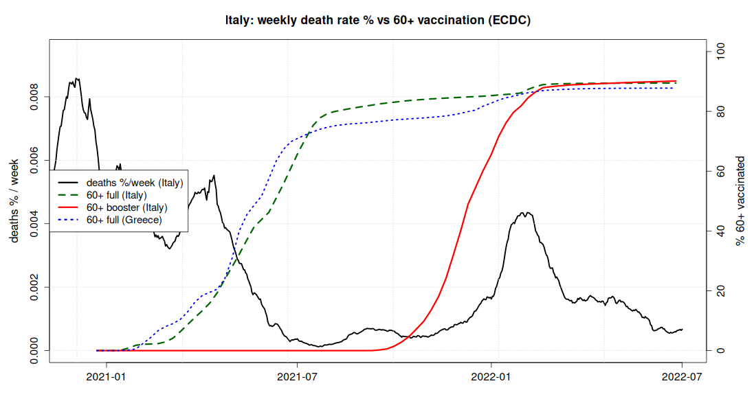
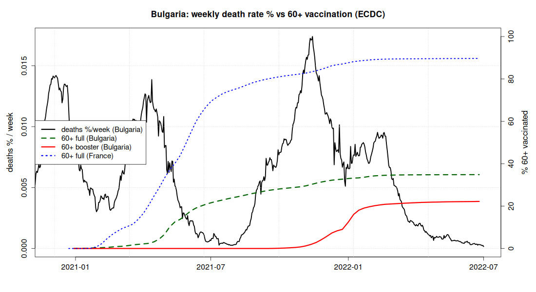
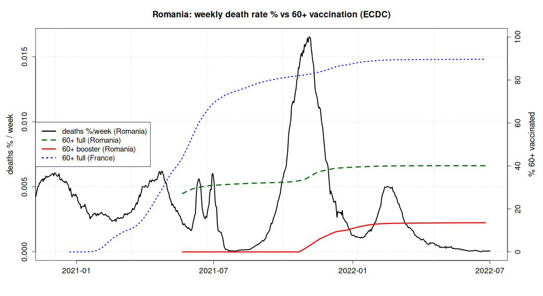
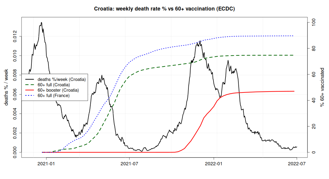
Each chart has two vertical axes and shows one country. The left one measures the deaths of the week, the right one vaccination coverage on a scale from 0 to 100%. The two curves therefore cannot be compared with each other in height, only in time: the question is not which line is higher, but where coverage stood at the moment deaths were rising. The legend inside each image gives the colours.
Overall vaccination (OWID)
Greece's largest death peaks (autumn 2021 and winter 2021-22) occur while the country was already 60-73% fully vaccinated: high overall coverage did not prevent the deadliest waves. At the other end, Bulgaria (30%) and Romania (41%) have the lowest coverage and, in total, 0.54% and 0.34% of their population dead, against 0.29% for Greece, 0.22% for France, 0.19% for Sweden and just 0.13% for the Netherlands; Croatia, with intermediate coverage (56%), is at 0.39%. So the vaccination-mortality relation is there and visible; it just does not explain everything.
Greece
France
Netherlands
Sweden
Italy
Bulgaria
Romania
Croatia
Vaccination of the elderly 60+ (ECDC)
With an age breakdown, the autumn 2021 wave strikes in the gap between waning primary immunity and the start of booster doses (red ≈ 0). The winter peak crests while the booster was still rising, late. The blue line in each chart is France, the reference country. Greece lags slightly behind it, but the gap is small next to the range of the sample: Greece 88%, France 90%, Italy 90%, Sweden 91%, the Netherlands 94%, while Bulgaria is at 35%, Romania at 40% (with boosters at just 22% and 14%) and Croatia at 75% (booster 47%). The two lowest-coverage countries also have the highest weekly peaks, roughly double the rest.
Greece
France
Netherlands
Sweden
Italy
Bulgaria
Romania
Croatia
Coverage at the moment of each wave
Final coverage is a misleading indicator: what matters is how vaccinated each country was when the wave hit it. The table shows 60+ coverage just before the Delta wave (October 2021) and the booster at the peak of Omicron (March 2022), together with the deaths of each wave separately.
| Country | 60+ full Oct 2021 | 60+ booster Mar 2022 | Deaths/million Delta (H2 2021) | Deaths/million Omicron (2022) |
|---|---|---|---|---|
| Netherlands | 93% | 87% | 187 | 83 |
| Sweden | 90% | 85% | 67 | 378 |
| Italy | 83% | 88% | 164 | 511 |
| France | 81% | 80% | 170 | 382 |
| Greece | 77% | 76% | 781 | 902 |
| Croatia | 67% | 46% | 1,063 | 852 |
| Romania | 32% | 13% | 1,295 | 362 |
| Bulgaria | 28% | 21% | 1,859 | 903 |
Click a column heading to sort the table.
In the Delta wave the ranking is almost perfectly the inverse of coverage: Sweden 67 deaths/million at 90% coverage, France 170 at 81%, the Netherlands 187 at 93%, Bulgaria 1,859 at 28%. Croatia, at 67%, pays 1,063: in between, exactly where its coverage places it. The one deviation is Greece: at 77% coverage, four points below France, it pays 781 deaths against 170, that is four times as many.
With Omicron, however, the column breaks down. The Netherlands, with an 87% booster rate, holds the wave to 83 deaths per million, one eleventh of the Greek figure. And at the other end, Greece and Croatia have almost identical deaths (902 and 852 per million) even though Greece entered the wave with a 76% booster rate among the 60+ and Croatia with 46%. This is the point where coverage, on its own, is no longer enough to explain Greece.
One further indication in the same direction: Croatia had the highest pre-vaccination peak in the sample (December 2020, 134 deaths per million per week). Its vulnerability predates the vaccines; Greek mortality, by contrast, is concentrated in the period after.
Data sources: JHU CSSE, Our World in Data, ECDC. Correlation is not causation; waves are also shaped by variants, seasonality, age structure and behaviour. Recorded deaths are also not equally complete across countries; for Bulgaria and Romania part of the difference may stem from different reporting and access to health services.
See also: the conclusion, ICU: beds and staff
Leave a comment
Comments are moderated, and appear with the site's next update.